Complete Wall Paint Colour Catalogue: Find Your Perfect Shade
Choosing the right wall colour is one of the most exciting and challenging parts of decorating your home. The possibilities are endless, with a limitless spectrum of shades and finishes offered by Astral Paints.
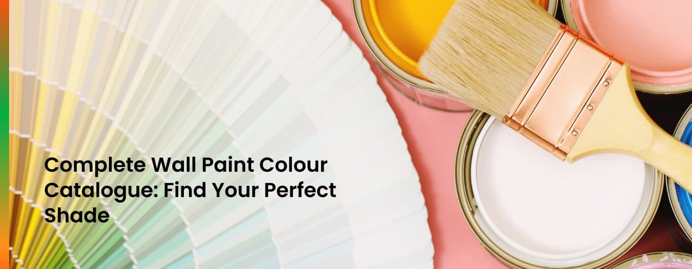
A well-curated wall paint colour catalogue can guide you through this creative process in choosing the most suitable colours that complement your style and space. In this guide, we will give you a thorough walkthrough of how to explore, understand, and choose the best wall colours for your home.
A. Understanding the Colour Families
Conventionally, a well-structured colour catalogue will be divided into different categories, making it easier to navigate and identify the shades that suit your needs. Here are some common categories:
- Reds and Oranges: These bright, energising colours are great for living rooms, dining rooms, or accent walls.
- Yellows and Greens: These shades symbolise freshness and tranquillity, making them perfect for kitchens, bathrooms, and outdoor spaces.
- Blues and Teals: These colours are cool and relaxing. They tend to work well in bedrooms or spaces you want to relax in.
- Purples and Pinks: These shades add a touch of luxury and elegance, enhancing modern and traditional interiors.
- Neutrals: Neutrals like beige, grey, and off-white are timeless and versatile, acting as the perfect canvas for any decor style.
- Whites: These shades range from pure white to creamy tones, which make the space feel bright and airy.
The key to getting the perfect shade for any of these categories is Colourtrip by Astral Paint. This superior colour-mixing technology guarantees exactness and consistency, allowing you to duplicate and discover opportunities to create any shade you can dream up.
B.The Importance of Colour Psychology
Different colours stimulate diverse emotions and can change a room’s atmosphere. Understanding colour psychology can help you make informed decisions:
- Red: Red represents warmth, energy, and passion. This colour is great for social spaces, but best used sparingly.
- Blue: Blue encourages calm and focus, which is perfect for bedrooms and study areas.
- Yellow: Yellow inspires cheerfulness and optimism and will be perfect for kitchens or playrooms.
- Green: Green symbolises balance and harmony. It is a great choice for any room.
- Grey: Grey is a modern neutral that complements bolder accents while adding sophistication.
- White: It symbolises purity and cleanliness, creating an open and airy feel.
C. Discovering Paint Finishes
The paint finish is just as important as choosing a colour for the ultimate look of your walls. Common finishes include:
- Matte: A smooth, non-reflective appearance, making it ideal for ceilings and low-traffic areas.
- Satin: It gives a slight sheen, making it perfect for bedrooms and living spaces.
- Semi-Gloss: This finish is durable and easy to clean. It is great for kitchens and bathrooms.
- High-Gloss: It adds a reflective, polished look and is primarily used for trim and cabinetry.
If you’re looking through a colour catalogue, check what finishes are available so that the colour you’ve chosen fits your functional and aesthetic requirements.
D. Using Colour Samples and Shade Cards
A good colour catalogue will usually possess shade cards or sample strips. This enables users to verify and compare shades in natural light. Here’s how to make the most of them:
- Test Multiple Shades: Paint small patches of potential colours on your wall and see how they look at different times of the day.
- Check for Undertones: Check for subtle undertones that show up under certain lighting conditions, like warm or cool tints.
- Match with Fabrics: Use shade cards and hold them against your upholstery, curtains, or rugs to make sure the design is cohesive.
E. Colour Ideas for Your Home
After you’ve browsed through the catalogue, you’re ready to get creative. Here are some innovative ways to use colours:
- Feature Walls: Choose a bold shade to highlight one wall as a focal point.
- Ombre Effects: Use light to dark blend to achieve a striking gradient effect.
- Contrasting Ceilings: Painting the ceiling with a different colour adds depth.
- Subtle Accents: Trims and mouldings are a great way to add pops of colour against neutral walls.
Final Overview
A complete wall paint colour catalogue is more than just a list of shades, it’s a doorway to endless design possibilities. You can feel confident selecting the perfect hues to transform your home with a little understanding of colour families, psychology, finishes, and a few practical tips. A well-thought-out colour palette can breathe life into your vision whether you prefer timeless neutrals or daring pops of colour, and create a space you will love for years to come.
When it comes to colour consistency and variety of colours, Astral Paints is the best. The Colourtrip technology guarantees that the colour you select is delivered to a “T”. Thus, you can design your home according to your vision and taste. Revolutionise your home with Astral Paints and make your dream house come alive in a splash of colours.